Home | eNewsletter | Contact - Inquiries
Fort Lauderdale, Florida: 954.761.8273
New Jersey: 856.336.8273
New Jersey: 856.336.8273
We are spending an increasing amount of time browsing and buying while on the go. Smart business recognizes this trend and capitalizes on it. The use of mobile devices is increasing every year as 55% of adults use the internet on their mobile device and statistics show it will only increase. Internet usage done by a mobile device is going to pass desktop internet usage by 2014 and 7.96% off all web traffic in the U.S. will be done by a mobile device.
Having a single website that works everywhere offers significant savings over creating multiple native mobile apps. If your website isn't mobile-friendly, you risk losing traffic, visitors, and ultimately business.

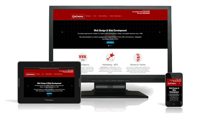
Responsive web design (RWD) is a web design approach aimed at crafting sites to provide an optimal viewing experience — easy reading and navigation with a minimum of resizing, panning, and scrolling — across a wide range of devices (from mobile phones to desktop computer monitors).
Mobile environments require simpler navigation, focused content and fast page loads. If a website has a responsive design, the user does not have to manipulate the site using "pinch and zoom," and the flow of content is more appropriate for a smaller screen. The site may reduce the amount of content presented to the mobile visitor, so it has less clutter and is easier to use. The website automatically adjusts according to the device's screen size, and orientation. Large or small - landscape or portrait; responsive sites switches between these on-the-fly.


